Monday, September 20, 2010

Human Compositions

Another exciting project for table 7!
(Lauren F, Elise, Jake, Travis, Fred, Adrian)

compositions with our bodies ideas:
1. sit indian style, wear black, shoot picture from above
2. two people make a dot together, wear black
3. cut out constuction paper dots to put on our face
4. stand in front of alot of lights so we come out really dark
5. wear black hats, shoot picture from above
6.***lay down and spread our hair out to make cirlces (travis will always be the big dot!)
7. top of heads stick out of water, play with distance
8. play with distnace on top of main hill, wear black
9. make blowfish faces and paint our faces black
10. draw the dots on our face with face paint

material ideas:
mainly to just wear anything white, we listed ten clothing items that are white that we could wear

white space ideas:
1. lay out paper
2. lay out sheets
3. use a pool and shoot black and white
4. shoot with a lot of light in the background
5. shoot negative
6. pour flour all over the grass
7. the white wall in the wash building
8. white sand in gulf shores alabama or pensicola beach in florida
9. 1000 gallons of milk
10. white clothes
11. white cars

So after all this brainstorming, my group decied on-
dots, the hair idea, and were all going to wear white, and then bring any other white clothing we have and sheets and pillowcases, towels, ect. for the white space.


after it was all done we had fun
i think it turned out alot better than we thought it would
heres some funny shots :)


The Critic

As we criticed our human dot projects, the group said that the different changes in direction actually helped my continuance composition out, also that the way the arms are shown give more direction to the peice. In the other composition however, the way the bodies were placed didnt help out. Everyone agreed that Travis having the longest hair was also a good thing because usually youd think a girl would have the longest hair, so thanks Travis!


Sunday, September 19, 2010

Bills Lecture 9/17

The Exquistie Corpse Part 2

The powerful man shot the awesome black dot.
In this picture that i took, the powerful man is getting ready to shoot.
I took this picture at a wax muesem in san antonio, this exhibit was about soliders.

Monday, September 13, 2010

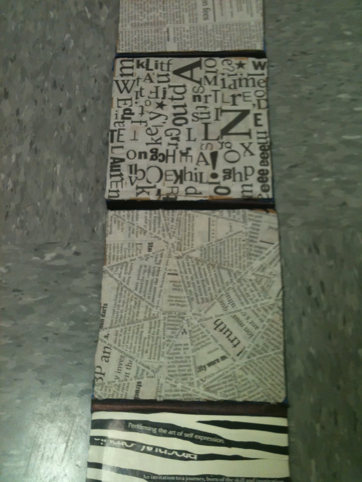
Project 1, Part 3: Text as Texture

As we started working on this part of the project, i decided i REALLY liked it!
I think after its all done, this little book is gonna look prettty cool.

This is what ive got so far, my favorite is the top left.
Im using the playful square design and i did a little experiment to see what it would like on the top left texture, and so far, that ones the winner :)
Ohh, and i just thought this was kinda funny, i only had one glue stick at my dorm and i ran out, so i was litterally scrapping the glue out with my scissors. it was a little messy, but i got all the glue out!


Three glue sticks, 2 houston chronicles and 10 sticky fingers later,
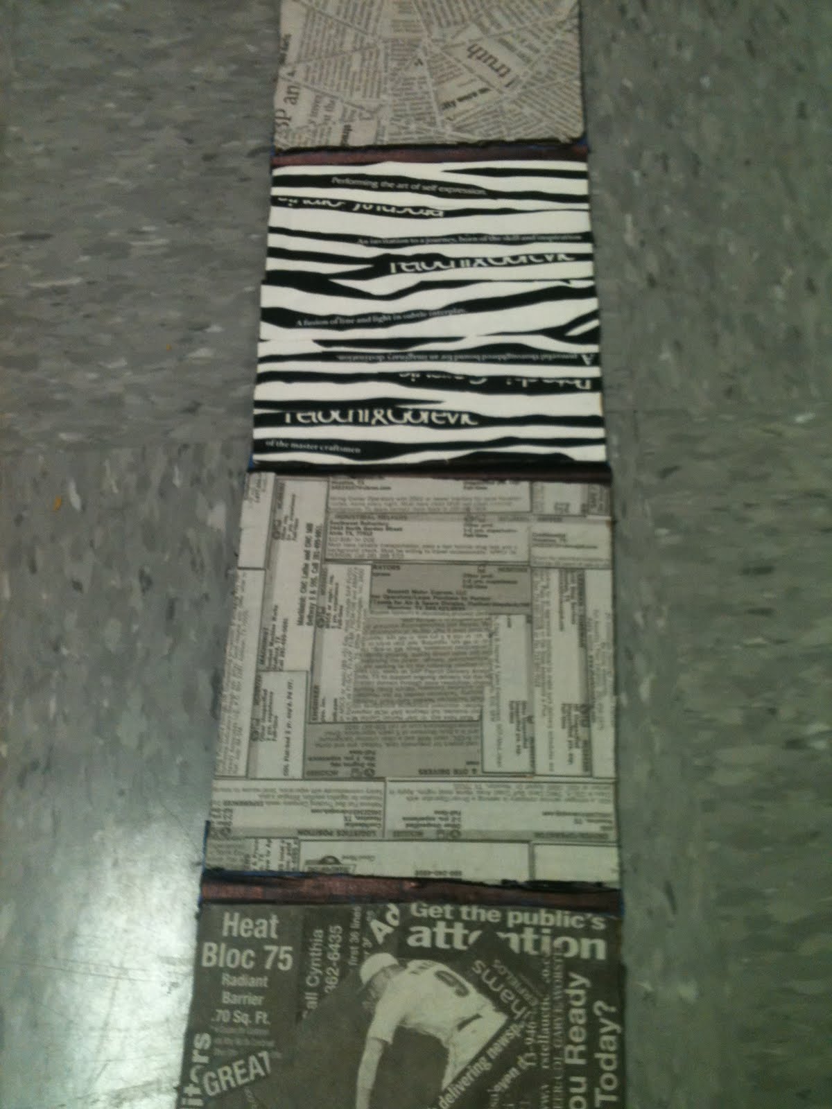
i came up with my 8 textures

During class i decided to change one of my textures, and then i finish my accordian book.
and i even finished my wall peice, i felt productive :)


Then i Redid it :)
The Critic of  Everything

My group thought that the zebra background (which the loved) gave the peice a cool jungle feeling.
They thought that the jagged lines of the biggest square worked really well with the background and they wished that all of the squares were really jagged on the edges. After looking through my acorrdian book, they also agreed that the zebtra background was the best choice for the peice. To improve it, they suggested making all the edges jagged  and getting rid of the cardboard "fuzzies" that were under the zebra pattern at the top.

Sunday, September 12, 2010

The Exquisite Corpse

So at the end of our lecture class friday, we pretty much played our own little version of mad libs.
It was very interesting :)

The powerful dude shot the awesome black dot!


After i first read this sentence, I automatically knew I wanted to take a funny approach to this project.
I took a photoshot class back in high school and know my way around the program pretty well, so I figured I'd take some snap shots of my little brother shooting his airsoft gun and photoshop this awesome black dot into it.
Needless to say, this was kind of a hilarious project to me:)


Tuesday, September 7, 2010

Project 1, Part 2: Square

I just wanna say, squares are so freshing after all those dots :)


Sooo after getting to class and working on these thumbnail sketches, I decided some of my solutions needed improvement and that I just needed more of them also, here's the improved page:


The workspace, gotta have some snacks around :)


Here are my final 8 skethches:
Periodical, Playful
 

and....my final 2!
Periodical, Playful

I chose this peridoical one becuase the first thing i see when i look at this is sturcture and seriousness (thats kind of how i  remember the difference between these two terms, ones serious, and ones not to serious). I dont really see any of the earlier terms present here, although im sure that some people could argue simliarity or whatever else they see.
I chose this playful one because to me it looks like its raining squares and it reminds me of a game called "Avanlanche" where you have to watch out for the falling squares and climb up them. It looks like alot of fun to me. Again i think that theyre arnt really any of the earlier terms present but some could argue that there are.

The Ctitic!
Again my group criticized my work today, they said that the message i was trying to get across was clear. The periodical design has continuance, similarity, closure, and its symmetrical. The playful design goes all over the square, and it has proximity and its asmmystircal. Neither one of the designs were strickly in the middle, there was a good use of negative and positive space, both designs are true to the term playful and periodical. From the dots to the squares, my craft improved and..
 PLAYFUL WINS:)
thats the one ill be makking like3D